

Why do colors look different from one place or device to another? A paint chip that looked calm blue in a shop can seem gray at home. A shirt can appear rich green outdoors and almost black in a dim restaurant. The same photograph may look vivid on one screen, muted on another and different again when printed.
Color is not produced by an object alone. It emerges from an interaction among the light reaching an object, the wavelengths that object reflects or emits, the surrounding scene, the visual system and the device or material used to reproduce the result.
Color theory gives artists and designers a practical language for hue, lightness, saturation, contrast and mixing. Color science adds measurement and models. Together they explain why a color can be physically unchanged yet look altered—and why two colors that match in one situation can separate in another.
Quick answer: why do colors look different? Illumination changes, surfaces reflect wavelengths differently, nearby colors influence perception, and vision adapts to the scene. Displays emit light, while inks and paints mainly absorb parts of the light falling on them. Devices and individual vision add further variation.
Color is a perception, not a label inside an object
Visible light is a small part of the electromagnetic spectrum. Different distributions of visible wavelengths can stimulate the eye in different ways. A red apple does not contain a permanent red glow. Under broad white light, its skin absorbs some wavelengths and reflects others toward the observer. Change the illumination, and the reflected signal can change even though the apple has not.
The eye converts that incoming light into neural signals. The US National Eye Institute explains that photoreceptors in the retina turn light into electrical signals, which travel through the optic nerve to the brain. Color is therefore an interpretation of sensory information, not a simple measurement printed on every surface.
Color can be described using several attributes. Hue is the family name—such as red, green or blue. Lightness describes how light or dark a surface appears. Saturation, sometimes discussed as colorfulness or chroma in more technical systems, describes how vivid or neutral a color appears. Two samples can share a hue while differing greatly in lightness and saturation.
Why do colors look different under changing light?
A light source has a spectral power distribution: it does not necessarily provide equal energy at every visible wavelength. Midday daylight, a warm household lamp and a narrow-band LED can all illuminate the same room with different mixtures. A surface cannot reflect a wavelength that is scarcely present. A blue fabric under light with little short-wavelength energy may therefore look dull or dark.
Brightness also matters. In low illumination, cone-based color vision becomes less effective and rod vision contributes more strongly. Fine hue differences become harder to see, and dark colors can collapse toward similar-looking values. Under very bright light, glossy surfaces may show pale reflections that reduce the apparent saturation of the underlying color.
Natural light changes with time, weather and atmosphere. The NASA overview of wave behavior notes that shorter visible wavelengths scatter more strongly in Earth’s atmosphere, helping explain a blue sky and the warmer direct light seen when sunlight travels through more atmosphere. A wall observed beside a cool blue sky can receive a different balance of light from the same wall near sunset.
Warm and cool light are useful descriptions, not guarantees
People often call amber light “warm” and bluish light “cool.” Correlated color temperature is useful, but two sources with the same quoted temperature can have different spectra and render materials differently. The International Commission on Illumination maintains technical work covering illuminants, color rendering and adaptation because “white light” alone is not a reliable specification.

Surfaces select, scatter and sometimes emit light
Material structure affects what reaches the eye. Pigments absorb some wavelengths and scatter or reflect others. Smooth coatings can add mirror-like highlights, while matte surfaces scatter light broadly. Texture creates small shadows. Transparent materials filter transmitted light, metallic surfaces have distinctive reflections, and fluorescent materials can absorb radiation at one wavelength and emit at another.
That is one practical answer to why do colors look different across paper, plastic, fabric and glass. A numeric color chosen on a screen does not specify gloss, texture, translucency or fluorescence. Even if two objects have similar color measurements under one standard condition, their physical behavior may differ elsewhere.
| Source of variation | What changes | Typical result |
|---|---|---|
| Illumination spectrum | The wavelengths available to reflect | A fabric shifts between daylight and indoor light |
| Illumination level | How strongly rods and cones contribute | Dark hues become harder to distinguish |
| Surface finish | Diffuse reflection, gloss and highlights | The same pigment looks richer when matte |
| Surrounding colors | Local visual context | A gray patch looks warmer or cooler |
| Adaptation | The visual system’s reference for white | A tinted room gradually feels more neutral |
| Reproduction device | Gamut, brightness, inks and profiles | A print cannot match a glowing screen exactly |
| Observer | Photoreceptor sensitivities and visual health | People may disagree about a close match |
How the eyes and brain build color
Human daylight color vision normally begins with three classes of cone photoreceptor, often described by their greater sensitivity to short, medium and long wavelength regions. The classes overlap broadly; they are not tiny red, green and blue sensors that respond to only one narrow band. The visual system compares their responses and processes those relationships through retinal and brain circuits.
Because perception depends on comparisons, there is no single wavelength for many everyday colors. Purple, brown and pink depend on mixtures, brightness or context rather than one spectral line. Brown, for example, can appear when a dark orange-like region sits within a lighter scene.
The brain also estimates what belongs to the object and what belongs to the lighting. This capacity is called color constancy. It helps a white page remain recognizably white in daylight and under a household lamp, although the light reaching the eye has changed. A real-world color-constancy study indexed by PubMed describes assigning a relatively stable color percept despite changes in illumination and surroundings.
Chromatic adaptation changes the reference point
Spend time in a room lit by a warm lamp and the orange cast may become less noticeable. Move immediately to a cool-lit corridor and it can look unusually blue. The visual system adapts to the prevailing illumination and recalibrates what counts as neutral. Adaptation is powerful but incomplete, and it depends on the scene, time and available cues.
Cameras perform a related operation through white balance, which estimates the illuminant and adjusts recorded channels. A wrong estimate or mixed lighting creates a cast. Human adaptation and camera processing need not make the same correction.
Why do colors look different beside other colors?
A color is judged relative to its neighbors. Place identical gray squares on dark and light backgrounds, and the square on the dark background usually appears lighter. Put identical neutral patches beside blue and orange regions, and they can acquire opposing color casts. These are forms of simultaneous contrast.
Research on individual variability in simultaneous contrast shows that spatial context affects both color and brightness perception, with meaningful differences among observers. Edges, surrounding saturation, pattern complexity and the perceived organization of the scene can all affect the strength of the result.
This explains why do colors look different after a designer changes only the background. The foreground color code may be identical, but its relationship to the surrounding field is new. A palette should therefore be tested as a composition, not as isolated swatches on white.
Additive and subtractive color mixing
Displays create color additively. Red, green and blue light from screen primaries combine at the eye. With all three channels near their intended maximum, the result approaches the display’s white; with the channels off, the screen approaches black. The exact primaries, white point and tone response belong to the display’s color space and hardware.
Paint, ink and many physical colorants work mainly through subtractive behavior. They absorb portions of the illuminating light and return what remains. Cyan, magenta and yellow are useful printing colorants because of the spectral regions they remove; black ink improves density, neutrality, detail and economy. Real pigments are imperfect, so mixing them does not follow the simple classroom wheel exactly.
Additive and subtractive systems are not competing descriptions. They address different physical paths. A screen emits light toward the viewer. A printed page requires external light, modifies it and reflects part of it. That difference sets a fundamental limit on screen-to-print matching.
Why do colors look different across screens?
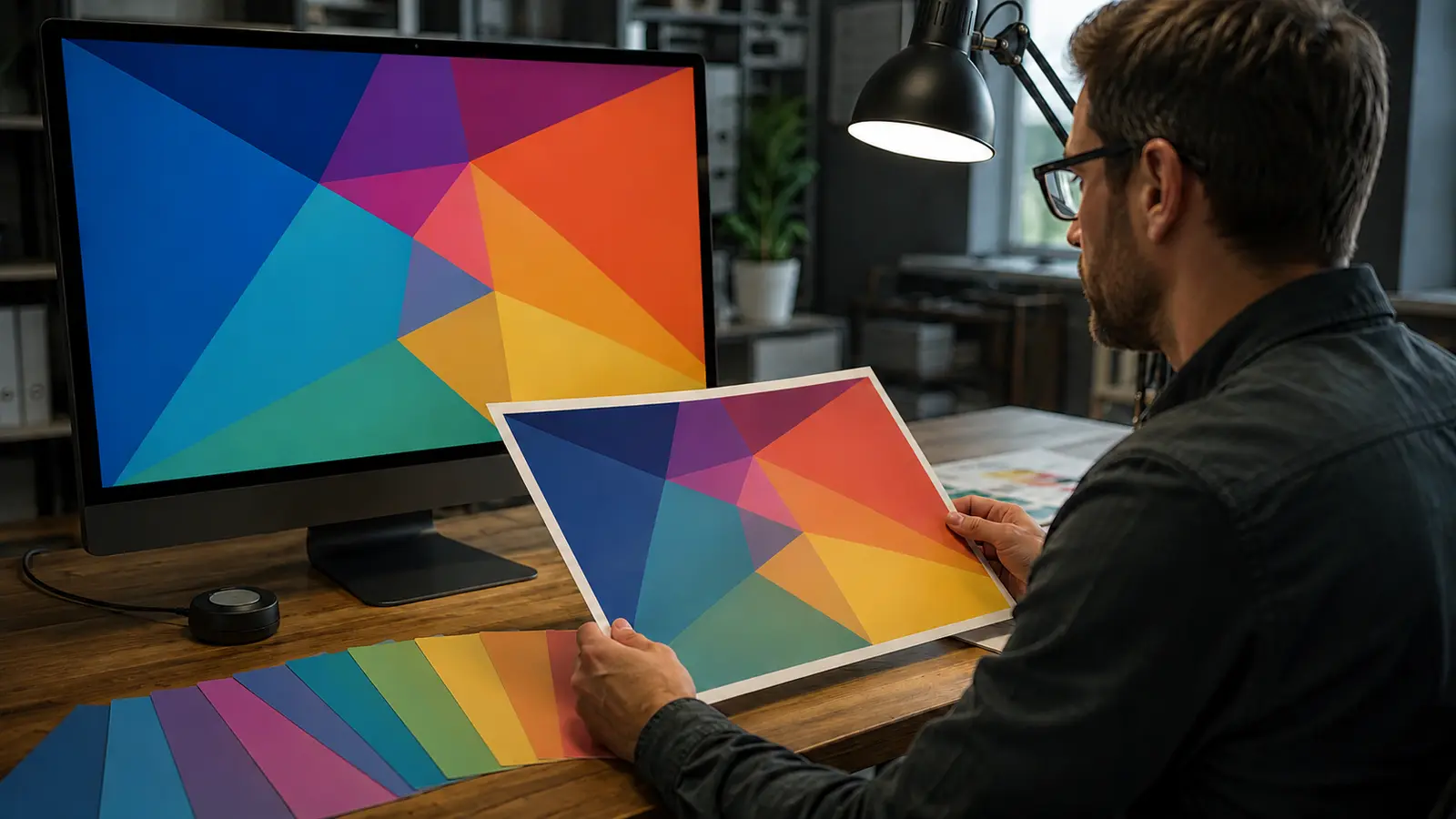
Two devices can receive the same RGB values but produce different light. Their primaries, maximum brightness, black level, white point, tone curve, color gamut, viewing angle, age and display settings may differ. Ambient light then changes the observer’s adaptation and adds reflections to the screen.
The W3C CSS Color specification defines sRGB and additional color spaces for the web, including how values relate to reference white points and color conversions. A defined color space gives numbers meaning; raw RGB numbers without an associated interpretation are incomplete.
For anyone asking why do colors look different on a phone and laptop, common causes include an untagged image, inconsistent color management, a wider-gamut screen, adaptive display features, brightness settings and different viewing environments. “Vivid” modes may deliberately increase saturation. Night modes change the white balance. Automatic brightness alters the contrast relationship with the room.
Why do colors look different in print?
A luminous screen can show bright saturated colors that a particular ink-and-paper combination cannot reproduce. Print has a smaller or differently shaped gamut for many colors. Paper white is also the light reflected by the sheet, not an emitted white. Coated bright paper, uncoated cream paper and recycled stock establish different starting points.
Ink formulation, dot pattern, press condition and drying can change the result. Gloss and optical brightening agents add viewing-condition effects. A proof viewed under suitable standardized light may look different near a window or under a low-quality lamp.
This production path is another answer to why do colors look different between a design file and the final object. Converting from a large display gamut to a printing condition requires choices. Out-of-gamut colors may be clipped or compressed, and different rendering intents can trade exactness in some regions for smoother relationships across the image.
Color spaces, profiles and calibration
A color space is a defined system for representing colors. A device profile describes how a particular device or printing condition relates its values to a standard reference. A color-management system can use source and destination profiles to transform colors while preserving the intended appearance as closely as the available gamut permits.
The International Color Consortium’s profile introduction explains that embedded profiles allow color data to be interpreted across computers and operating systems. The ICC also notes in its implementation guidance that profiles for capture, display and output devices can be combined through a color-management module.
Calibration brings a device to a chosen state, such as a target white point and brightness; profiling characterizes that state. A profile cannot correct glare, unstable hardware or a printer that is physically out of control.
For high-accuracy tasks, instruments measure light or reflected spectra. A NIST overview of CIE color measurement discusses sources, surfaces, calibration and uncertainty. Measurement improves repeatability, but tolerances must still suit the material and purpose.
Metamerism: a match that breaks under new conditions
Two samples can have different spectral reflectance curves yet create the same tristimulus values under a specified illuminant and observer. The CIE calls this property metamerism. Such samples are metamers: they match in the stated condition, not necessarily everywhere.
Change the lamp and the match may fail. This is illuminant metamerism, familiar when two fabrics match in a shop but separate in daylight. Change the observer and a close match may also change because real eyes differ slightly even among people with normal color vision. Cameras introduce another set of spectral sensitivities, so a match seen by eye may not photograph as a match.
Metamerism is not a defect in perception. It follows from representing complex spectra with a small set of responses. The practical defense is to compare critical samples under more than one relevant light source and, when necessary, specify spectral or tolerance requirements rather than approving one visual match.
People do not all see color identically
Normal variation in lens, macular pigment, cone sensitivities, adaptation and age can shift close judgments. Fatigue, medication, eye disease or neurological conditions can also affect vision. Color vision deficiency makes certain distinctions difficult and can be inherited or acquired.
The National Eye Institute’s color-vision guidance explains that color vision deficiency usually changes the ability to distinguish particular colors rather than turning the world entirely gray. A design that communicates only through red-versus-green differences can therefore exclude users even if it looks clear to its creator.
Observer variation belongs in the answer to why do colors look different, but disagreement does not always mean that someone’s vision is abnormal. Ambiguous lighting, small samples, low contrast and device differences can make reasonable observers report different appearances.
A practical method for choosing reliable colors
- Define the final medium. Decide whether the color must work on a phone, desktop display, office printer, packaging material, painted wall or several of these.
- Control the viewing condition. Compare samples under the light in which they will be used. Avoid judging beside strongly colored walls or direct glare.
- Use a defined color space. Embed the intended profile in images and keep color management enabled through editing and output.
- Calibrate important devices. Stabilize display brightness and white point; maintain printers and use the correct paper-and-ink profile.
- Test the full composition. View colors beside their actual backgrounds, text, photographs and materials rather than approving isolated swatches.
- Proof the real output. Soft proofing can predict gamut changes, but a physical proof is valuable when paper, ink, finish or lighting matters.
- Check accessibility. Use adequate lightness contrast, do not rely on hue alone and test with color-vision simulations without treating them as a substitute for users.
- Allow tolerances. Manufacturing, lighting and observers vary. Specify what difference is acceptable for the purpose instead of demanding an undefined “perfect match.”
Frequently asked questions
Why do colors look different in photos?
A camera has its own spectral sensitivities and processing. Exposure, white balance, picture style, display profile and viewing light can change the result. One global white-balance adjustment cannot fully neutralize mixed lighting.
Why does paint look different after it dries?
Drying changes light scattering, gloss, opacity and texture. The substrate, number of coats and surroundings also matter. Test a fully dried sample on the intended wall in daytime and evening light.
Are RGB and CMYK colors directly interchangeable?
No. RGB describes additive-light values; CMYK values describe printing colorants for a particular printing condition. Conversion needs profiles and a rendering choice, and some RGB colors cannot be reproduced by the target print process.
Can a hex code guarantee the same color everywhere?
A hex code commonly specifies an RGB triplet interpreted as sRGB on the web. It does not control screen calibration, brightness, ambient light or the observer, so it cannot guarantee identical appearance.
What is the best light for comparing colors?
Use a controlled source appropriate to the intended viewing condition. For everyday purchases, compare the sample under the actual daylight and artificial lighting where it will be used.
For more accessible explainers across science, design and technology, explore the SOAKJAM Knowledge library.
Conclusion
The answer to why do colors look different lies in a chain: illumination supplies wavelengths, materials modify them, surroundings provide context, eyes encode the signal and the brain interprets it. Screens, inks, profiles and individual observers add further transformations.
Color theory helps organize relationships; color science helps measure and predict them. Neither makes every medium identical. The reliable approach is to define the viewing condition, manage the color data, test the actual context and accept sensible tolerances. A color is not a solitary number—it is an appearance produced by a whole viewing system.
Transparency
Sources & references
- National Eye Institute — How the Eyes Work
- NASA Science — Wave Behaviors
- International Commission on Illumination — Publications
- PubMed — Color Constancy in Real-World Settings
- SAGE Journals — Individual Variability in Simultaneous Contrast for Color and Brightness
- World Wide Web Consortium — CSS Color Module Level 4
- International Color Consortium — Introduction to the ICC Profile Format
- International Color Consortium — Frequently Asked Questions
- National Institute of Standards and Technology — CIE Fundamentals for Color Measurements
- International Commission on Illumination — Metamerism
- National Eye Institute — Color Blindness
Editorially reviewed
Editorial information
SOAKJAM articles are designed for clarity, useful context and transparent sourcing. Important facts should be checked against the linked primary sources.
Found an error, outdated detail or a useful source we should consider?